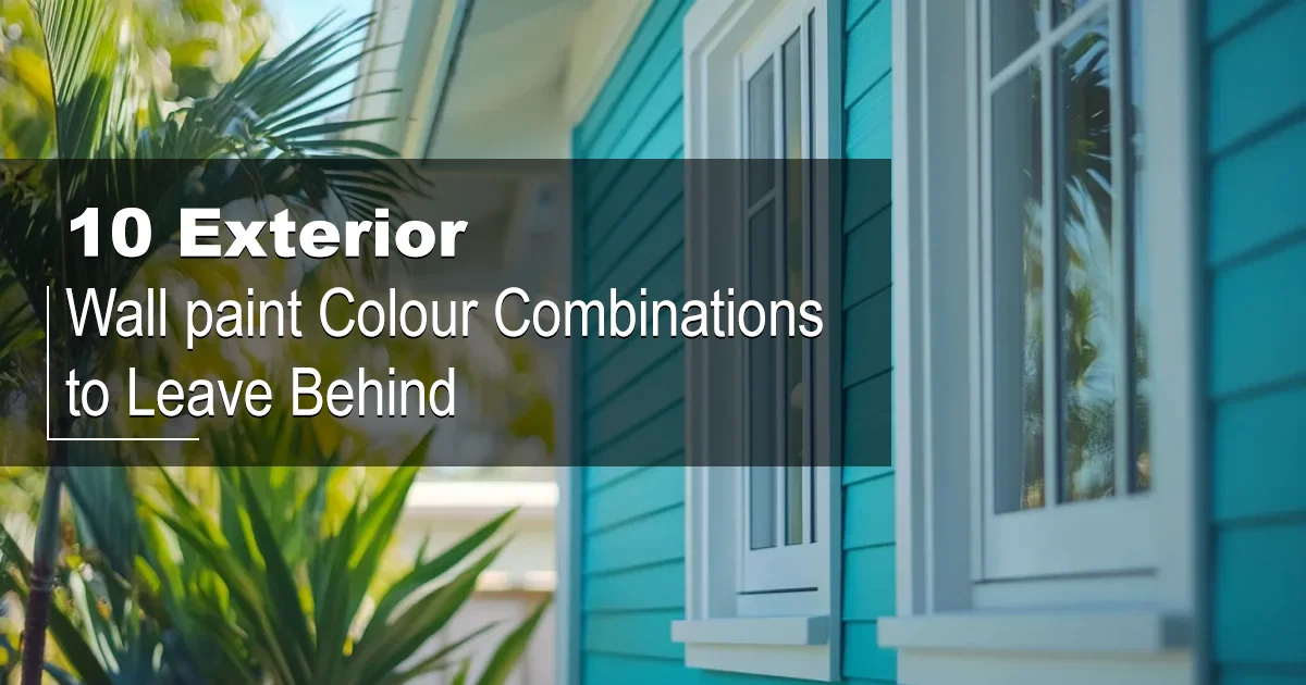
In architectural parlance, colour is more than just surface treatment. It is structure, shadow, proportion, and light. It interacts with form, environment, and perception, and yet is often relegated to mere aesthetics. This has been nowhere more true than in the selection of exterior paint, where inappropriate combinations can dull visual interest or overwhelm form altogether.
The true power of paint can elongate façades, sharpen trims, soften hard edges, or enlarge compact-looking homes in the eye's perception. When the best exterior wall paint colour combination is wrong — too loud, too busy, too thematically inconsistent — it is architecture that suffers in silence.
This article will serve as a corrective eye: ten exterior wall colour combinations that tend to fail, trend-wise or preference-wise. A discriminating homeowner or architect shall be offered this simple guide, enabling them to make colour decisions that honour both the structure and streetscape.
See also: Dining Room Interior Design Ideas: Perfect Blend of Comfort & Style
Why Exterior Wall Paint Colour Combination Matters for Your Home?
Most people refer to paint as the first indicator of a home's character. A well-chosen palette enhances architectural lines, creates a welcoming ambience, and adds value to real estate, while poor combinations do the opposite, usually resulting in an undefined visual hierarchy, awkward contrasts, and low curb appeal.
Do not forget that climatic and lighting considerations, urban by-laws, and the demography of what your neighbours paint must influence your choice of exteriors. It is not just what looks good in itself, but what works in context. This is especially relevant in the exterior paint combinations Indian market, where regional preferences, dust levels, and sunlight exposure can greatly influence perception and durability.
Read also: Innovative Two Colour Combination for Bedroom Walls You’ll Want to Try
10 Exterior Wall Paint Colour Combinations to Avoid in 2025
Bright Red and Neon Green: They are Visually Aggressive
These two colours are opposite to each other on the colour wheel; however, they tend to clash with each other over large outdoor surfaces. One may associate them with the celebration mood, rather than permanent and tasteful architecture.
Professional Insight: Neon hues reflect more light, making them look even more intense outdoors. Use this colour with strong primary colour combinations, and the difference will be an unbearable clang instead of a sweet harmonization.
Recommended Alternative: Pair burnt sienna or brick red with sage green or olive to achieve a balanced and earthy facade.
Black and Electric Blue: Stark
Both black and electric blue are dominant colours, and together, they create a very cold and rigid aesthetic. One will not be tempted to see the palette; rather, repelled.
Professional Insight: More than enough high-contrast dark shades on the exterior compress visual depth as they absorb natural light, making the structure look smaller and heavier.
Recommended Alternative: Modern elegance will be created by combining navy or muted cobalt with soft greys, taupes, or off-whites.
Pure White and Bright Yellow: Overexposed & Maintenance Heavy
Bright white and sunny yellow can make one's residence seem overly reflective, especially in the sun-drenched regions. They are pure, cheerful on their own, but washed out when slapped together.
Professional Insight: Bright colours fade more quickly than muted colours under UV exposure, and frequency will dictate the repainting of these hues to keep them vivid.
Recommended Alternative: Buttermilk or pale lemon with ivory, warm beige, or stone grey.
Pink and Aqua Blue: Mood Disorder
These two colours refer to opposite poles of emotional experience—theirs being romantic and tropical, and when thrown together in proximity, they engender confusion rather than charm. The picture is inartistic and rarely coincides with the style of the house.
Professional Insight: The psychology of colour plays the biggest role in exterior palettes. Clashing emotional cues detract from visual appeal.
Recommended Alternative: Powder blue with soft greys or rose pink with dove white would be more subtle, cohesive impacts.
Brown and Purple: Dull Visually
Rich purples combined with earthy browns create a perhaps muddy facade, dull, lacking contrast and definition. Such combinations are old-fashioned and do little to emphasize architectural details.
Professional Insight: When two colours sit too close to each other in visual weight, especially in muted tones, they tend to cancel each other.
Recommended Alternative: Pull chocolate brown with off-white, or pigment plum purple with creamy beige or sandstone for more clarity and depth.
See also: Modern Safety Door Designs for Flats: Security, Style & Vastu Explained
Bright Orange and Violet: High-Voltage Clash
This is a very bold combination and is best kept in abstract art rather than used for a home exterior. It does not work tranquillity into the eye but tends to overwhelm one's view due to saturation and intensity contrast both colours have.
Professional Insight: Cohesive attention-grabbing effect is realized by high chroma colours like orange and violet.
Recommended Alternative: Bring subtlety and sophistication by the use of terracotta with beige or lavender with misty white.
Green and Yellow: Excessively Vibrant for Exteriors
These two colours might just be too bright when they are used together. Although the colours are reflective of nature, the brighter versions tend to be way too exuberant and simply unfettered when used simultaneously. This is a forced pairing today, especially in modern or urban settings.
Professional Insight: Natural tones do best when muted, desaturated, and in forms that reflect their real-world counterparts.
Recommended Alternative: A nature-based palette would be reflected in sage or moss green paired with light tan or eggshell.
Multiple Bold Colours on One Facade: Overdesign
Some homeowners attempt to mix 4-5 contrasting bold colours to achieve an eclectic style for their homes. It seldom works in actual practice, especially if there is no hierarchy of design. The effect can be disorganized and chaotic.
Professional Insight: Visual order in architecture depends largely on clarity of focus, pointing to the use of supporting colours in contrast to a lot of attention-grabbers.
Recommended Alternative: Model yourself on a three-tone theory base, secondary colour, and trim/accent, in addition to having two or more neutrals.
Red and Blue: Is This for Nationalism or Property?
Red and blue are rampant institutional colours, or institutional colours that flag considerations almost unjustifiably for the exterior canvas of a house.
Professional Insight: Colour should directly express and complement the structure's form and function. Stay away from combinations that invoke certain symbols unless this is relevant in context.
Recommended Alternative: Cranberry red with muted navy trims against warm beige siding.
All Black with No Contrasting Trim: Too Harsh
While all-black homes have gained newfound favour in modern architecture, going black to the saturation point without any contrasting elements wooden accents, light trim, or huge glass projects a fort-like impression.
Professional Insight: When maintaining extreme minimalism, a lack of contrast would make a home heavy and less welcoming.
Recommended Alternative: To soften the intensity of the all-black exterior, incorporate walnut wood panels, white window frames, or metallic trims.
See also: Interior Design Guide: Best Classroom Reading Corner Ideas
Professional Advice for Choosing Exterior Paint Combinations

To save yourself from design regrets and subsequent costs of repainting, adhere to some of the tried-and-tested principles:
Look at the Landscape and Climate of the Site
Colours behave differently in response to natural light and environmental context. In warm zones, light shades are favourable to reflect heat; cooler ones do justice to dark shades.
Take Roof Colour and Material into Consideration
The roof is permanent. The colour of your paint should go with its texture and shade—be it slate, terracotta, concrete, or shingle.
Look at the Style in Architecture
What looks good on a Spanish colonial house may not apply to a mid-century modern design. Let the structure inform the palette. This is especially crucial in rural settings where the outside colour of an Indian simple house in a village often draws inspiration from earth tones and local materials.
Natural and Neutral Base Will Never Go Wrong
Neutral bases like soft off-white, taupe, beige, and soft stone give wonderful flexibility. They are also less likely to go out of date or clash with any new accents in the future.
Use High-quality Paints and Hire a Good Applicator
No palette is going to work if the paint is of a low quality or not applied correctly. The exterior walls are under the constant onslaught of sun, dust, and rain; therefore, choose a strong paint.
See also: How to Choose the Perfect Wall Painting Design Ideas for Your Home Makeover
Conclusion: Avoid These Exterior Wall Paint Colour Combinations for Better Curb Appeal
When it comes to combination colours for the wall, aesthetic instincts should be complemented with good design rationale and environmental context. Faulty combinations hurt even the best designs, and a well-thought-out pairing elevates a simple house into timelessness and dignity.
Steering clear of the ten problematic combinations avoids winding the project in an ill-fitted direction. If you are perched on the fence about colour choice, it always pays to engage a colour consultant or an architect—these two drainage point options will pay long-term dividends in satisfactory visual appeal and property value.
Ultimately, finding the right combination of colours for a house is less about boldness and more about balance, setting, and architectural soul.


Leave a Comment